Cohesive and Streamlined UX with Audience Demographics Reimagined
The problem:
Update demographics graphs to create a more user friendly experience.
New user interface updates were made to the reporting page due to our partnership with a new charting package. We decided to update the demographics tables and use more standard language that users are more familiar with.
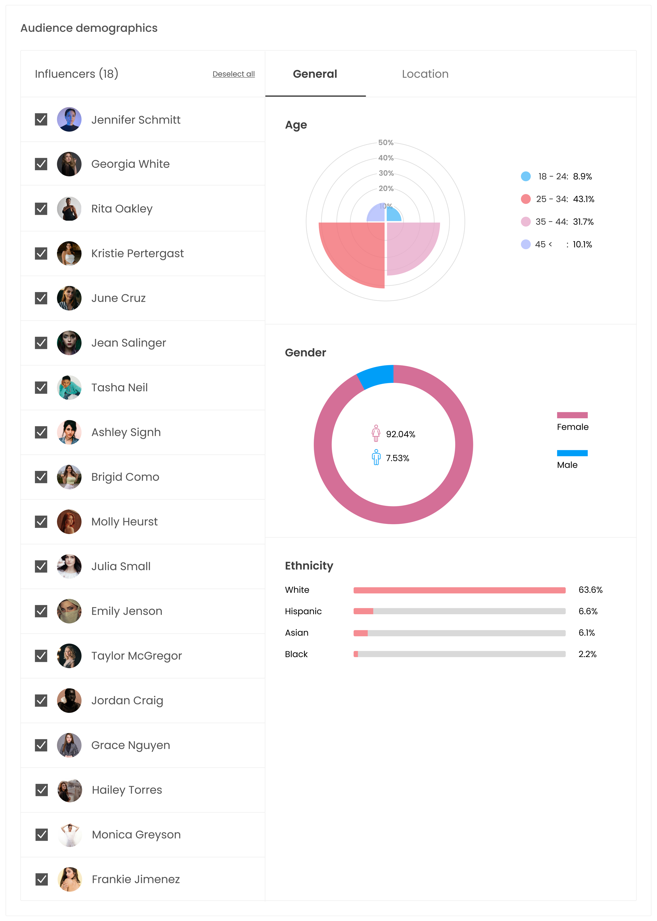
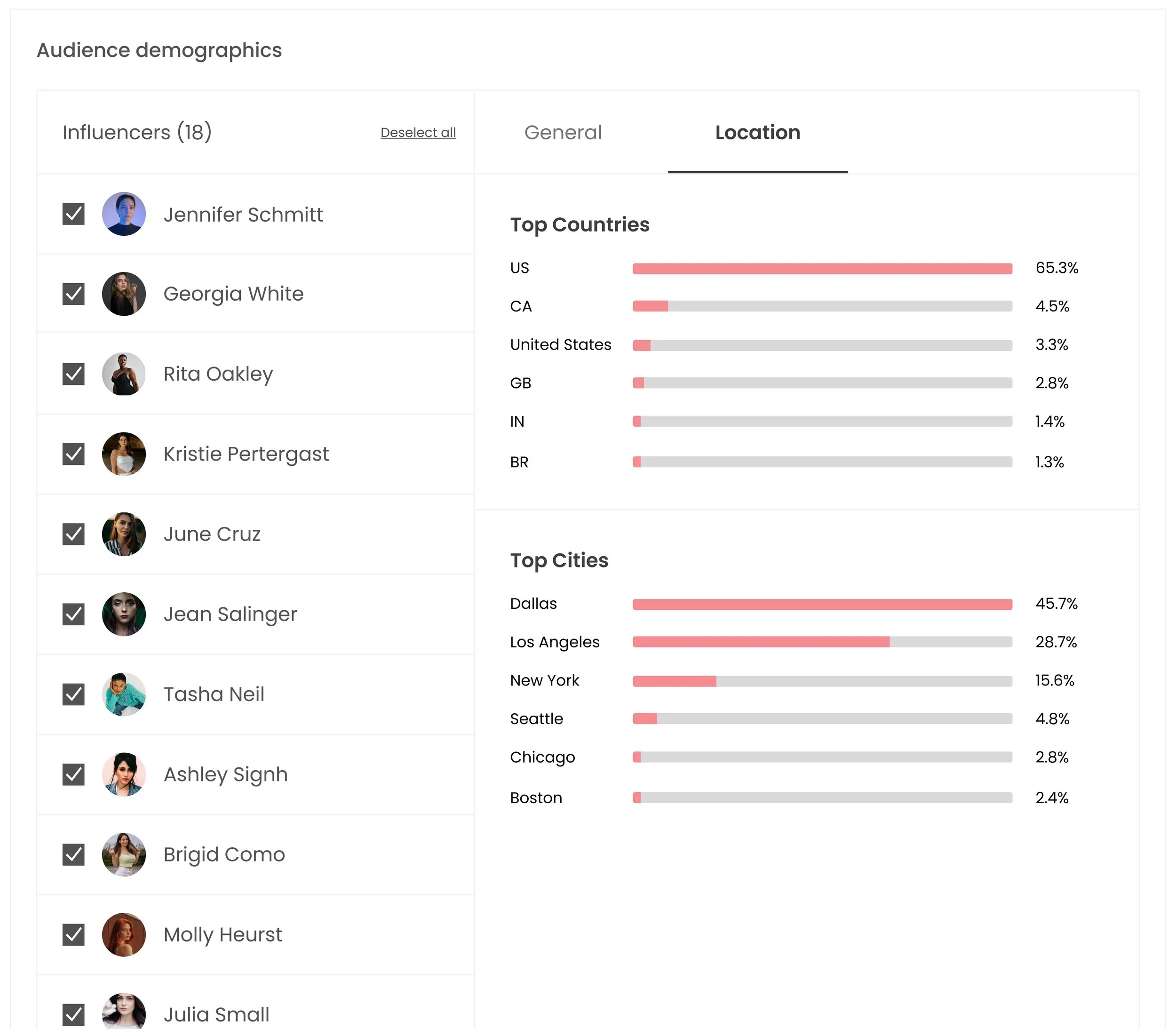
Before
Endless influencer list that causes the user to continuously scroll the page
Age chart can be hard to interpret at a glance
After watching users interact with this section it was apparent not many users would visit the location tab; hides information
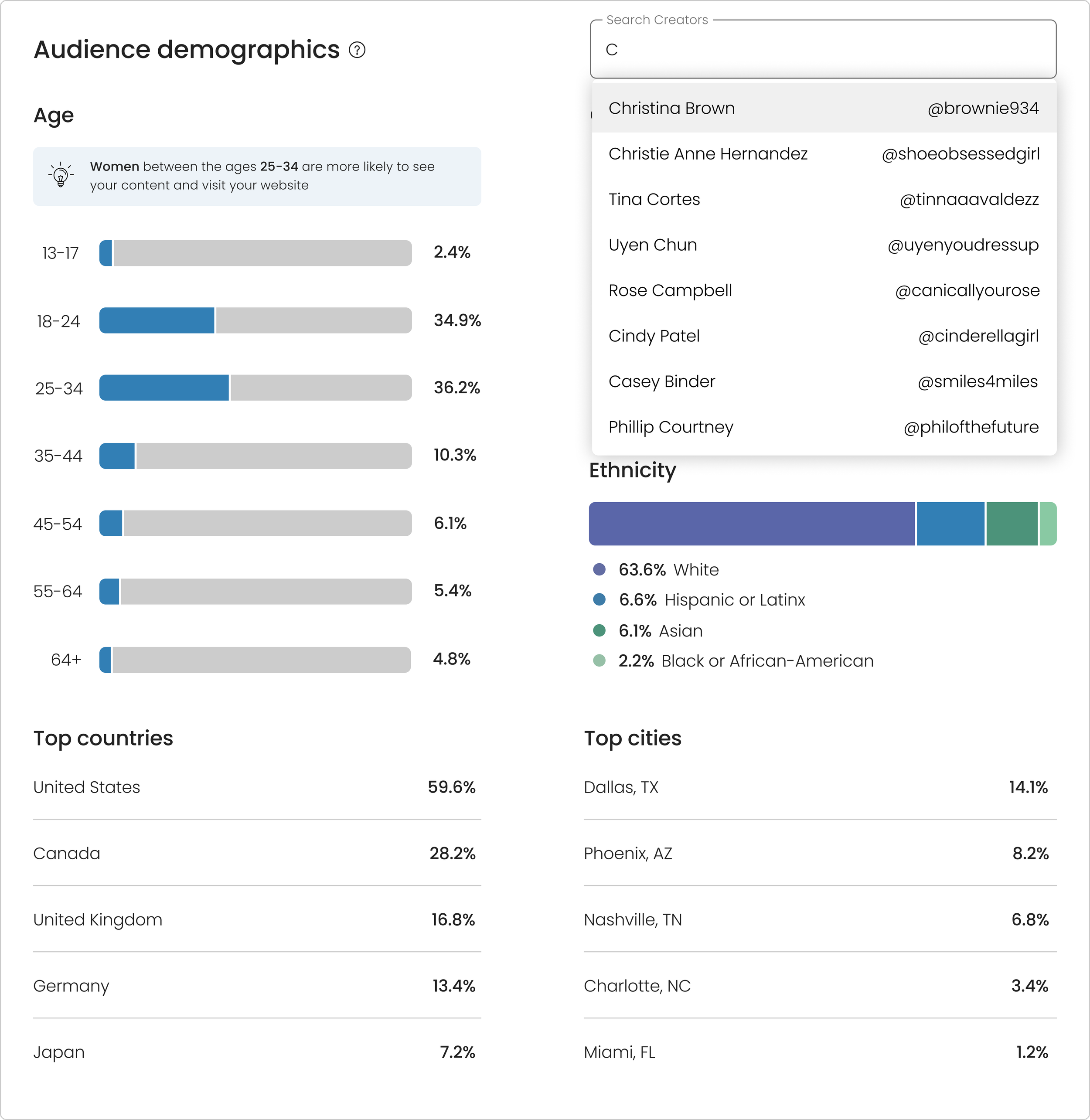
Tedious for the user to find specific influences if they want to narrow down the results
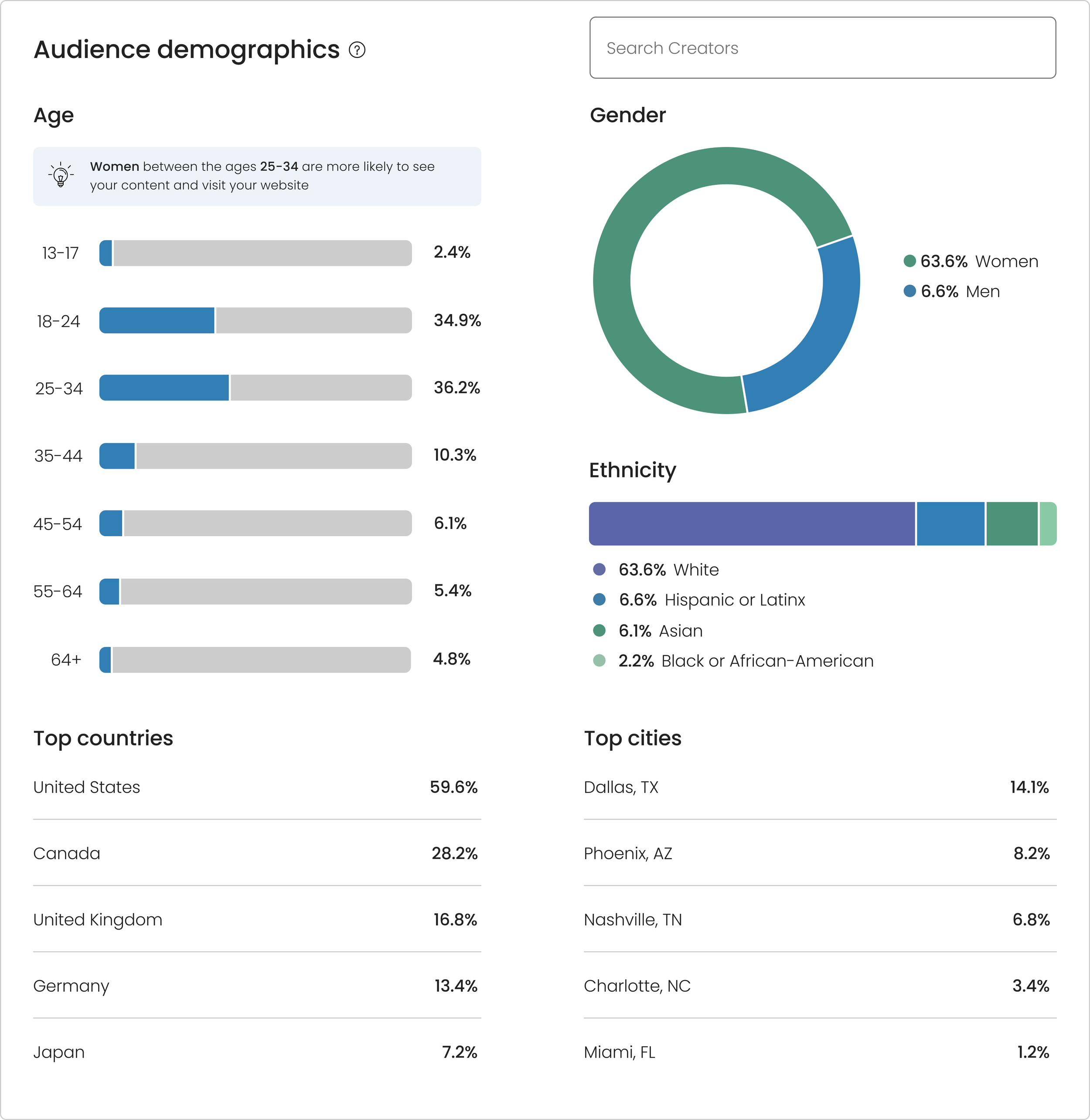
After
Age: There were too many segments to do a stacked horizontal bar chart and pie chart so I went with these bars instead that help break up the numbers
Gender: Since there are only 2 potentially 3 categories ideal, that makes this ideal for donut/pie chart (a lot of competitors use circle/donut charts as well)
Ethnicity: Not common practice to include this category in the examples I looked at, therefore, I did not want to take up too much space on this page with this content, but I felt the stacked bar chart represented the data well since we only have 4 ethnicities
Top city/country: After discussing with the design team we felt this gave a nice break from the bars and was a nice easy way to scan the data visually
Blue education summary: I wanted a way to add a quick take-away from the content that they are looking at in a digestible way so I added a summary component that would be dynamic with the data


